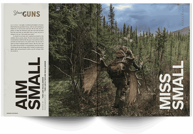
To take a look at the fractures above and below the West Texas terrain, you have to fly across the country, get in a car that will take you to a gas station in the middle of no where, where you will then get in truck and drive until dusk to find the space between two towns, without a name, with only an oil rig, a coffee shop built out of a shed and a post office. Here you’ll talk to those who trace the place between progress and catastrophe, challenges and change, here you’ll shake the hands of those who do the hard work and talk about those who reap the rewards like ghosts.
In “El Llano Quebrado, The Fractured Plain,” West Texas native John Rutherford — who is as familiar with oil rigs as much as he is putting his pen to the page — and internationally acclaimed photographer Blair Getz Mezibov explored the changes of a contentious industry and connected with the hands and lands that have both defined and been effected the most by the work to harvest energy. Our Design Director, Padraig Croke, chose this article to be one of V16’s featured, bespoke pieces — cultivating a unique style to frame this stark and stunning story.
These three creatives have brought a masterpiece to print and shared with us some of the processes and realizations that shaped this subculture profile.
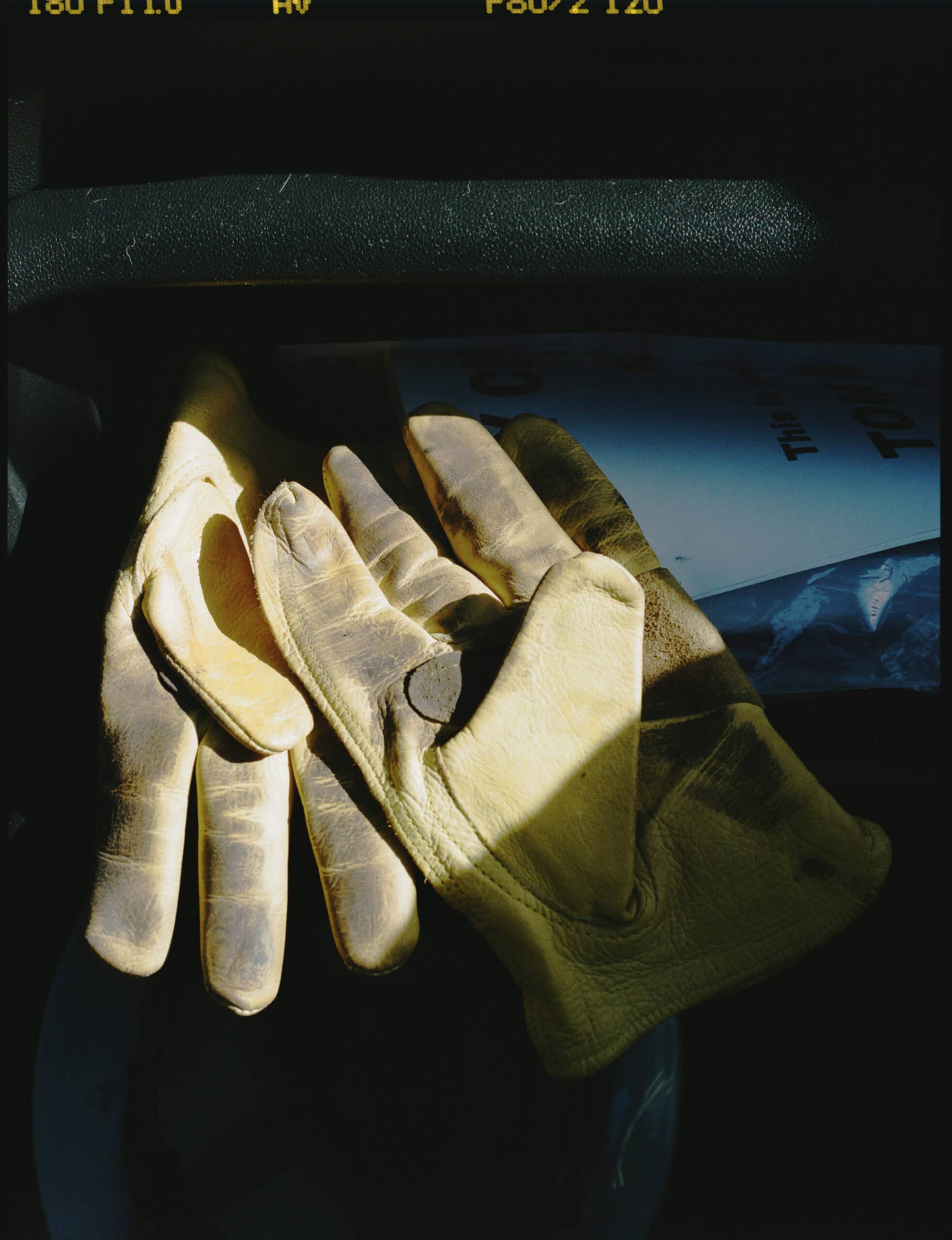
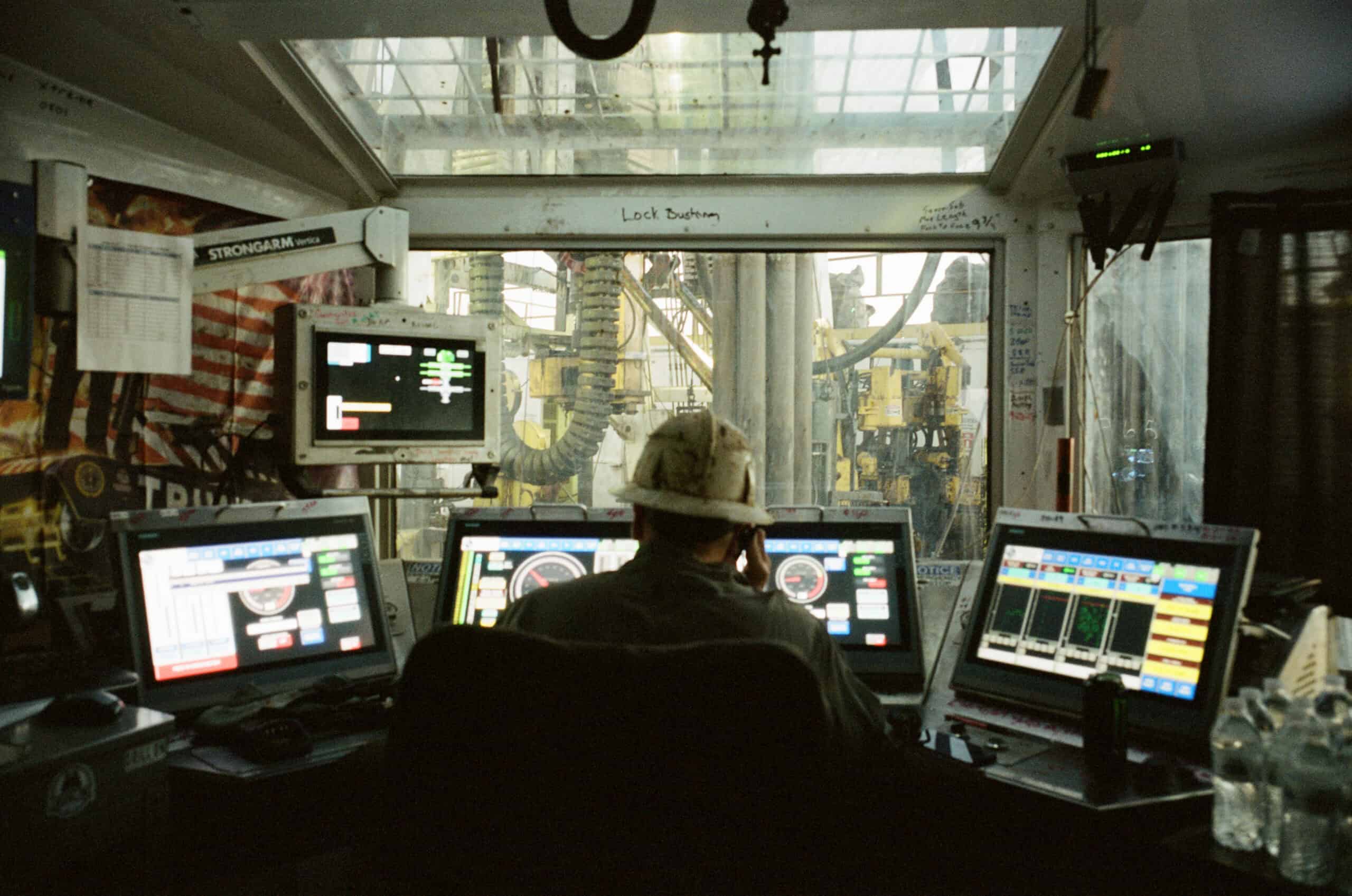
"Like any shoot, you have to adapt. When I go out there, I take account of my surroundings — fewer than I’d expected, rigs run with more technology than hands these days. I take stock of the light, the people, the textures. It was dusk when we first landed. Way out there is surreal. The land goes on without edges. These places are alone in the middle of it all, like on another planet. I had to pull in close, create an intimate view to not get lost in the land," said Blair.
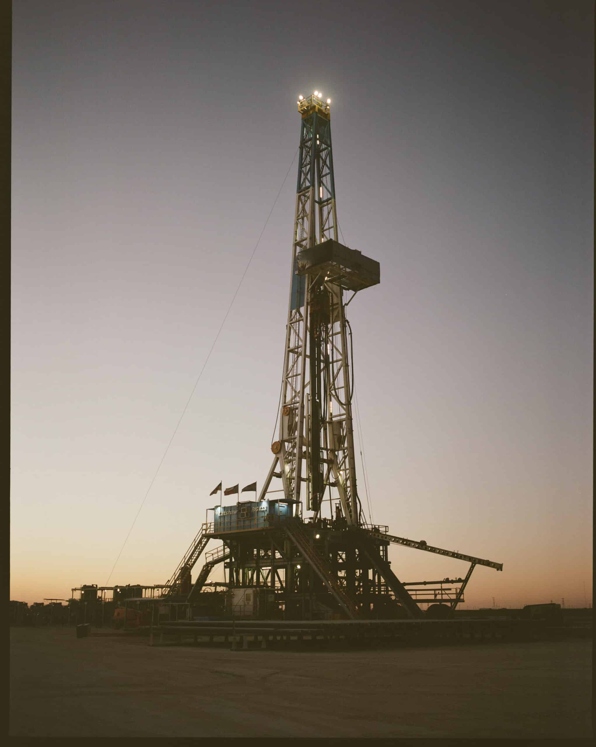
"The land stretches out in every direction so far. It reminds you that it’s larger than us. Up on the rig, feeling big and bulky with all of our safety gear on, it’s intimidating and loud and if you’re not used to it, terrifying. There’s the Hollywood version and then there’s this, the real version. The side that takes account of the everyday, of the silence, of the only sound of the deafening loud rig — of the people who are actually behind the dangerous process of bringing this kind of energy to the rest of us."


Iron is dumb. People execute plans, they’re the intelligence behind this whole thing," said John.
"For this piece, I wanted to try to imagine the scale of the buffalo herds and reservoir rock before humans intervened, the density of the resource birthed all the passion and technology that surrounds it. Gold may well be dense in values, but hydrocarbons are dense in action. This piece brought me to a struggle with the morality of progress. History shows clearly that humans are the lords of conversion. The things I often deem visionary are actually a thirst for that."
"The writing pulled me in as much as Blair’s 120 film and 35mm snappy grain, I could feel the grit under my collar as I read John’s story," said Padraig Croke, Modern Huntsman's Design Director.
"I wanted to strike a balance between giving the piece weight on the page, while allowing for the photos and the writing to live on their own. There’s nothing worse than a good story being overwhelmed by a fussy layout.
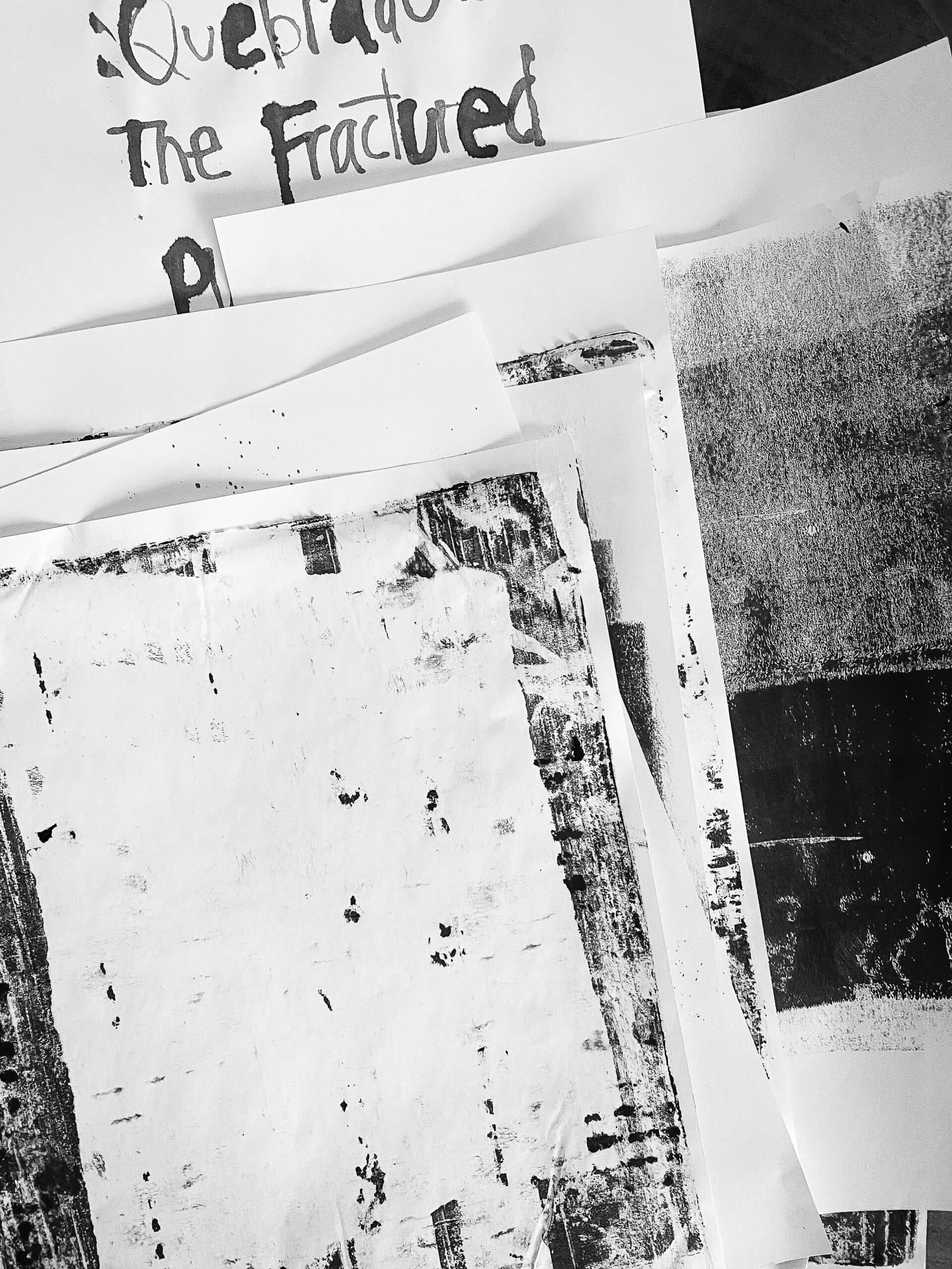
I used a combination of acrylic inks for the typography, experimenting with different tools to write. I tried a toothpick but it was too delicate. In the end I used the back of a medium paintbrush. When I’m working on a bespoke type like this I’ll often write and rewrite the phrase or sentence several times at different sizes, I find hand lettering works well if your original is somewhat close to the scale it will be at when it’s on the page when you scan it… especially if there are several instances of the type style throughout the piece. If elements are being scaled up and down to fit, inconsistent scale and line thickness is distracting."


"For the textures, I worked with acrylic paint, a gel plate and anything I could find around the house to add patterns. I wanted them to feel thick and oily and dirty, with a slightly industrial aesthetic. To achieve this I rolled the paint on thick to the gel plate and pressed corrugated card and masking tape on to remove the paint before pressing it to the page. Then it was a matter of scanning in the results and layering with the text, images and pull quotes."