Old World, New Maps

WORDS BY Katie Marchetti

PHOTOS BY Paul King

SOUTH CAROLINA | GREEN POND


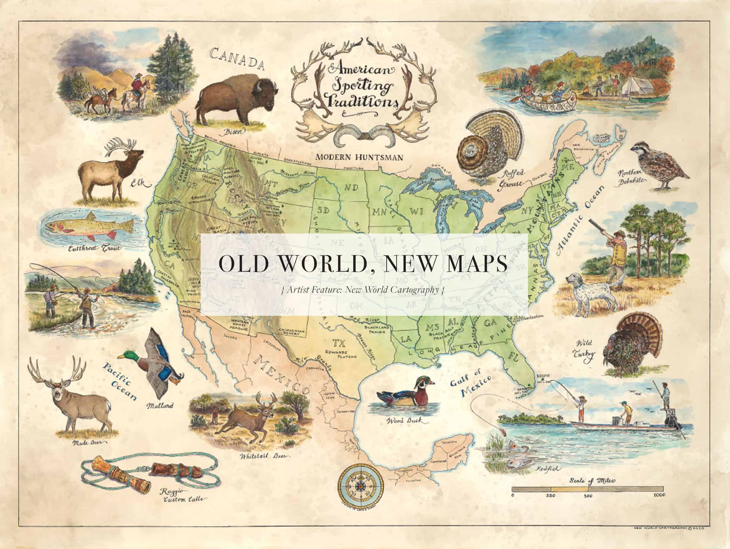
A map unfurls and fingers trace the leading lines of where we’re going and where we’ve been. Whether the year is 1784 or 2020, an aerial view of land and sea allows us to navigate environmental intricacies.

Formed in the lowcountry of South Carolina, New World Cartography resides where the past and present meet. For centuries, explorers have charted their course into unknown territory by the maps that would deliver them home again. Today, two men continue the tradition of hand-drawn maps, crafting 21st-century landscapes inspired by the antique maps of old.

For founder and designer Travis Folk, maps were an essential tool in obtaining his Ph.D. in wildlife biology and continuing his conservation work at Folk Land Management. As his fascination with maps grew, so did his desire to translate the sterile presentation of the information he was gleaning into a medium that was robust with life.

He partnered with classically trained artist Tony Waters in 2015, and they now work together in the age-old craft of producing accurate, informative maps with captivating original drawings depicting the unique flora and fauna of the topography.

Tony entertains a life-long enchantment with the history and allure of pirates and treasure maps to be found along his coastal home of Charleston, South Carolina. Each modern map conveys the same enchantment, his handiwork noted in the skill of hand-drawn lines and text, showcasing the brilliance of hand-applied coloration.

“It’s somewhat like the monks and their illuminated manuscripts,” said Tony. “The words are there, but the calligraphy and illustrations draw interest and attention.”

Reviving the tradition and process of originally designed maps, each commissioned piece is drawn, printed and then colored by hand — adding to the distinctiveness of each piece. Coloration techniques vary from watercolors to colored pencils selected for a specific look and feel. Each map is also affixed with a unique serialized nameplate to the rear of the frame, further underscoring the individuality of each map.

“I like maps because they are such a different way to look at the world, whether it is historical or current day,” explained Travis. “It amazes me that I can ride down a creek or road in the lowcountry that you can also find on a map from the 1700s.”

“I hope our maps help people remember and understand particular parts of the world,” said Travis. “I think maps can remind someone of a great experience in a particular part of the world or enhance their understanding of the world around them.”

He and Tony were commissioned by Modern Huntsman to create a map that reflected the traditions and stories bound within these pages, as a beautifully informative addition to Volume Five: Traditions.


EXTENDED INTERVIEW

Tell us a bit about your personal interests in mapmaking, and what you find so intriguing about the tradition of cartography. 

Travis: I have always liked maps.  I grew up in the Lowcountry of South Carolina and people have been mapping this part of the country for hundreds of years. It amazes me that I can ride down a creek or road in the Lowcountry that you can also find, for example, on a map from the 1700s.

 I also did graduate research on wood ducks and northern bobwhites. Both were radio telemetry projects where we tracked these species for months or years. The objective was to estimate survival, reproduction and movement of these species and then relate that to different types of habitats.  This was, by definition, a spatial analysis so we were looking at and analyzing maps of bird movements. Maps made that visualization and analysis possible.

I’ve always been intrigued by the detail of the older cartographers. When you look at the minutiae on those maps you find some great art work.

What  led to the creation of New World Cartography? Tell us about your journey towards formation and what that journey has been like. 

I finished my PhD in wildlife biology in 2006 and came back to South Carolina to work in Folk Land Management, a company my dad founded in the early 80s.  He is a forester and wildlife biologist and the company primarily works on private plantations and assists with habitat management and timber management projects.  When dad started the company, he had an older forester, Henry Sauls, that would hand draw maps that they would use to understand acreages and linear distances of certain aspects of the plantation.

Luckily Henry was also an incredible artist so he would produce one of these hand drawn maps for the owner and have sketches of deer, turkey, cypress, etc. included.  These were beautiful and would usually be hung in the gun room or living room at the big house.  We still have drawers of his hand drawn maps from years ago.

When I got back in 2006 I used GIS to produce maps, which are accurate and sterile.  It was quite a contrast between one of my maps and Henry’s.  (A lot of the properties we work with have been clients for decades so we have files with Henry’s maps and our more recent GIS maps.) This got me thinking about trying to get GIS to produce a map that has the look, feel, and allure of hand drawn, hand colored maps. I tried to manipulate the software every which way but ultimately realized it can not be done.  It is as simple as a single line. A digitally derived line is both straight and of uniform width for the full length. The hand drawn line will have minute variations, which when absorbed all across the map give the map a real allure. Certainly lettering, symbology for forest types, color variation, etc. all add to give a hand drawn, hand colored map authenticity.

When I realized GIS couldn’t produce these types of maps, I then started to think about how they could be made.  Luckily at this point a mutual friend introduced me to Tony Waters.  He is a classically trained artist with a great aesthetic sense.  I knew what the maps needed to look like and Tony had the skill and talent to make them come to life – then New World Cartography was born.

Tony:  I suppose my attraction to maps began in childhood.  I was born and raised in Charleston, a city that is proud of its history and has preserved many, many of its historic buildings.  Inevitably, to such venerable places are attached tales of  brave and wicked people, like Blackbeard, a notorious visitor to our fair city. What young child has never dreamed of  finding a map to a pirate’s treasure?  None.  I never found a stolen or hidden map, but I sure liked to imagine it.  And later, when my parents would take my sister, brother, and me on vacations, I was always interested in studying maps to see where we were going.  That started my love of traveling and seeing as much of the world as possible.

As an artist from a very young age (I used to draw on the wall next to my crib), I’ve always tried to draw, color, or paint different things, but never thought about drawing maps until I met Travis.  He described what he wanted, and I could imagine what he described, and the rest has been a terrific friendship of  7 years!

What does your typical process look like for creating these maps from start to finish? 

It depends.  If it is a commissioned map for a client, there are several conversations and emails to discuss the design features.  In most cases, clients are very excited to have their own map but not sure how to dissect the features and make design decisions.  We discuss things from the size of the map to the area covered to the fonts used to color palette.  These are enjoyable conversations because we are helping the client make a dream come to fruition.

In general for all of our maps, the creation process is two fold:  first it is ink work then coloration.  Research and design considerations are the precursor though to actually creating the maps.

Another enjoyable component to map design is research.  We did a map of oyster varieties in North America so it gave me an excuse to get several good books on that topic.  I get to research things that interest me when we do a map for the business.

Tell us about the sort of functions that a map can have beyond just information. What role can aesthetics or beauty play in it?

I’ve thought about this point.  I’ve questioned myself as to why we consider maps from the 1700’s, for example, to be so beautiful.  The French were especially adept at producing maps that were so aesthetically appealing.  I think a really well done hand drawn, hand colored map is a perfect blend of information and beauty.  Visual things (not just maps) that convey information tend to draw you in for inspection.  That period of inspection is even more pleasing when the “visual thing” is beautifully drawn and colored. Maps fall squarely into that category.

Tony: It’s somewhat like the monks and their illuminated manuscripts; the words are there, but the calligraphy and illustrations draw interest and attention.

In what ways do you feel you are honoring the tradition, and where do you see room for improvement?

We honor the traditions of older cartographers by using their maps as design inspiration for ours. As an example, we use older maps as a starting point for considering different font or color combinations. Color combinations especially must work together. Greens and blues are a natural combination.  Darker yellows and reds and oranges are good too for upland features like state boundaries, etc.  Looking at a range of older maps is a great benchmark for natural design combinations in maps.

It’s almost a double edge sword though. In most maps we like to respect the aesthetic of older hand drawn, hand colored maps, but in some instances you may want to move in a different unique design direction. I had a client ask for a map of the Southeast but in a very modern design vein. I was excited to “rethink” our design approach to work in this sleek, metallic, minimalist design aesthetic.

Because our maps are a representation of the world, they will always fall short in being able to exactly describe the spatial layout of the world around us. We are always thinking of better approaches and techniques to visually convey information about the world. I always get excited when we think of a new way to show a river, a coastline, a pine versus hardwood stand.

 Tony: I like the attention of detail that we can enhance the drawings and the different color palettes that are basically similar, but some may be subdued colors, and other times , more vibrant that appeal to  the clients’ preference.

With each map, I learn something different to enhance my technique.

How does your hunting heritage play into some of the map design? What sort of hunting traditions did you have growing up?

Some of our recent maps have focused on wildlife and the natural world.  I am thinking of our oyster map, duck map and bird dog map.  All of these are things I enjoyed growing up.

As a kid in the lowcountry, if fishing was slow and it was low tide we would grab some oysters off of the beds and crack them open with a screwdriver.  Oyster roasts are also a big, winter social event down here. I love oysters and folks down this way have had the locavore mindset with oysters for years before it became trendy. If you were from Beaufort, your oysters were better than the ones from Bulls Bay above Charleston and vice versa. The diversity of oysters is so numerous that I wanted to pay homage to that with the oyster map. We have 125 varieties of oysters on that map and we weren’t able to include them all!

I also grew up duck and quail hunting, completing my Masters on wood ducks and my PhD on quail. Our duck map was a way to celebrate that heritage. We included the migratory flyways and labelled some of the major waterfowl habitats across the lower 48.  Of course I made sure to include the SC Lowcountry on the map.  I grew up pouring over field guides so I was also excited to include sketches of ducks around the perimeter.  It was fun to sit with Tony and discuss the specific morphological features that are distinctive for a particular species.  For example, the elongated body form of the whistling ducks is very different from that of the other dabblers.  Or the speckled lemon feathers under the wing of woodies.  Also, as a nod to his incredible contribution to field guides, David Sibley’s bird guide was a good visual guide for Tony when doing this work.

Tony:  I’m not a hunter, but I grew up with a number of uncles and great-uncles who were and had my share of rabbit, squirrel, deer, and who knows what my great-grandmother threw in the pot, and they took me on the occasional fishing trip.

Now, I did go crabbing a lot off the dock of my great-grandmother’s house on Church Creek.  Chicken necks and twine and a scoop net was all we needed.  My great aunt would make hats out of the newspaper for us so we wouldn’t get sunstroke in that summer heat. The real excitement began when the crabs balked at going into the boiling pot.  Some would jump out , and my aunts and grandmother let out shrieks and cries began and the crabs would snap their claws before being caught. They sure tasted good.

Tell us about the process for making this map for Modern Huntsman?

This was fun, especially talking with Tyler and Tito about their thoughts for the map.  I also used this as a chance to get caught up on the Into the Wilderness podcasts when they discussed MH to pay better attention to the thought, philosophy, design, etc. that is associated with MH.  I hope our map conveys the same level of authenticity to the hunt, the land, the people as MH does.

The actual process of making the map was like our others.We had some conversations and emails to better understand their vision, then started the design and layout work.  Ink work started to lay these thoughts down and coloration will be the last step to make the map really come to life.

What has been one of your favorite maps to create? 

Tough question.  Each one is fun whether for the beauty of the design work, getting to know a client and their property (for property maps that are frequent commissions)

Tony: I think we adopted  someone else’s quote: “Our favorite one is the one we’re working on now.”

I learn something from each map I draw, whether it’s technique, coloration, or even learning something about the area/location I’m putting on the map.  However, the one that was the most challenging was a HUGE map of the Port Royal Sound Area.  It measured 9 feet tall by 14 feet wide.  I had to work on panels of paper 3 feet x by 9 feet, using my dining table since my drafting table nor my art room was not big enough. There were some glitches and some delays, but we still made the deadline.  I did not see the completed work (i.e., the 5 panels were photographed and pieced together by the photographer) until it was displayed  in the Maritime Museum.  I was overwhelmed but glad we had taken the challenge and succeeded!

What legacy do you hope to leave with your work?

I hope our maps help people remember and understand particular parts of the world.  I think maps can remind someone of a great experience in a particular part of the world or enhance their understanding of the world around them.  Hopefully some of our maps have done that for the clients and customers.

Tony: I appreciate the faith our clients have in us.  Knowing that we have made something that is cherished and personal to them gives me great pleasure.  And just maybe, we may inspire future cartographer-artists!

Is there anything else that you’d like to add that folks may not know about cartography?  

I think many people have a difficult time conceiving that someone could actually draw and color a map.  That it is truly a product of the hand and not a computer.  In today’s digital world, this is one small thing that can relay the passion of artisanship.  I hope our maps convey our passion for this type of creativity and craftsmanship.

LISTEN TO THE PODCAST INTERVIEW FROM INTO THE WILDERNESS

Related Stories

Latest Stories

Lure of the Laguna

Lure of the Laguna

Lure of the Laguna is the first film in our four-part series with Lone Star Beer. Chapter One features angling savant Ben Paschal and his obsession with saltwater fly fishing on the coast of Texas. It’s a story about hard work, dedication, and bailing on the internship his parents wanted him to take to follow his passion in the Laguna Madre.
El Observador

El Observador

“El Observador” is a short documentary following wildlife cinematographer Austin Alvarado and explores his relationship with nature via his work pursuing black bears in Far West Texas. It is a visually stunning journey through the Big Bend region that highlights the incredible resilience of bears that have returned to this area. "El Observador" is a Modern Huntsman film presented by SWAROVSKI OPTIK.
Matagi

Matagi

“The word ‘matagi’ is derived from ‘matagu’, meaning to cross over, step over or straddle, bounding an image of people between two worlds — the realm of humans and that of the mountain deity: yama-no-kami.” Scott Schnell, Ph.D., Associate Professor Emeritus in Anthropology This post is only available to members.

Pin It on Pinterest